|
BIOL 3110
Biostatistics Phil Ganter 301 Harned Hall 963-5782 |
Eulychina castanea fruit |
|
BIOL 3110
Biostatistics Phil Ganter 301 Harned Hall 963-5782 |
Eulychina castanea fruit |
The Normal Distribution
Back to:
Academic
Page |
Tennessee
State Home page |
Bio
311 Page |
Ganter
home page |
Unit Organization: This chapter focuses on the most often used probability distribution, the normal, and introduces probability density functions, the idea of standardization, and testing to see whether or not data agree with the normal curve.
Problems:
Problems for homework (from 3rd edition)
- 4.1, 4.2, 4.3, 4.4, 4.21, 4.36, 4.40, 4.45
4th edition homework problems
- 4.3.1, 4.3.2, 4.3.3, 4.3.4, 4.4.6, 4.S.11, 4.S.15, 4.S.21
Suggested Problems (from 3rd edition)
- 4.7, 4.9, 4.12, 4.17, 4.20
4th edition supplemental homework problems
- 4.3.7, 4.3.9, 4.3.12, 4.4.3
The Normal Curve (=bell curve, = Gaussian Curve)
Perhaps better to call it the Gaussian distribution, as normal here does not mean normal in the usual sense and many normal things do not have a normal distribution.
The normal curve is expected when variation from the mean is due to some random influence. If you measure the length same thing with the dame ruler, you might get a cluster of close values with the differences caused by a variety of errors. If the errors are random, the lengths should be distributed normally
The great utility of the normal does not come from its occurrence in nature. It comes from the fact that sample statistics differ from population parameters and that the differences are normally distributed. Many statistical tests are based on the normality of the difference between sample and population
x-axis is the random variable under consideration
y-axis is the frequency with which a particular value of the variable occurs or the probability of getting that particular value of x
For the normal distribution, the mean = median = mode (the most probable value).
the distribution is Symmetric about the mean (a curve that is not symmetric is said to be Skewed to the left or the right)
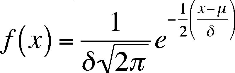
The normal frequencies (Densities in the book) can be calculated from the following equation
= population mean,
= population standard deviation
x = value of random variable, e = base of natural logarithms = 2.71...
Notice that we are using population parameters, not sample statistics, so Greek symbols are used. If you look at the graph, you can tell that the values of x chosen for calculating the graph were between 200 and 600.
Also Notice that the left-hand side is not y, as you might be used to. f(x) means the value of the function of x, which is what y is, so the two are just different ways of writing the same thing. The f(x) values are graphed on the y axis and are the probabilities of x
Inflection points
These are where the curve changes direction and there are three (from left to right)
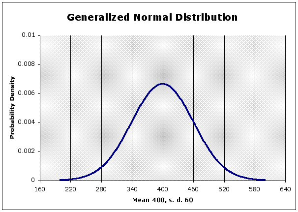
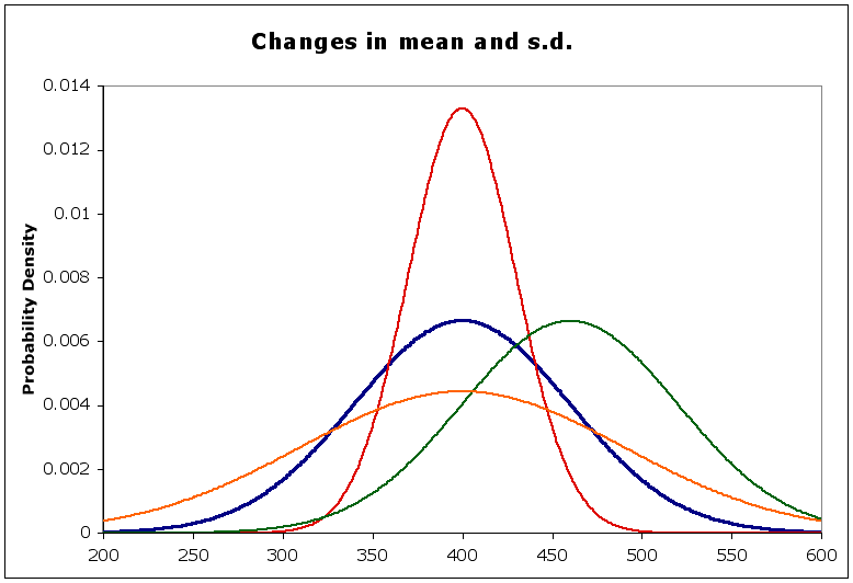
The shape of the curve depends on the standard deviation, It is flatter when s.d. is large, peaked when s.d. is small (compared to the mean). The position of the curve along the x-axis depends on the mean.
In the diagram below,
- the blue curve is the normal with a mean of 400 and a standard deviation of 60, as above
- the red curve has the same mean, but a smaller st. dev (= 30) - notice it is sharper than the blue. Why is that?
- the orange curve has the same mean, but a larger st. dev. (= 90) - notice that it is flatter than the blue. Why?
- the green curve has a different mean (= 460) but the same st. dev. Compare its shape to the blue curve.
The area under the curve represents probabilities.
if x can range from -infinity to infinity, then the area represents the probability of all possible values of x, which must be equal to 1
Imagine a vertical line going from the x-axis to the peak at the curve at 400
this would divide the curve into two equal halves (remember it is symmetric)
this means half of the curve is less than 400, or the probability of being below the mean is 0.5
the same can be said for the probability of being above the mean
Areas under a normal curve
Z-ifying or Standardization of a symmetric curve
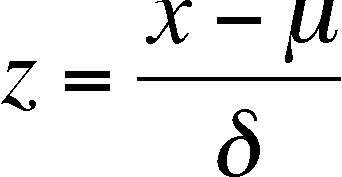
z is a new variable, calculated from the old (x) that allows you to compare symmetric distributions with different means and standard deviations (in terms of x)
Standard areas under a normal curve expressed as z values
- 1z to 1z = ~68% of area under curve (68 % of all observed x values)
- 2z to 2z = ~95% of area under curve (95 % of all observed x values)
- 3z to 3z = ~99% of area under curve (99 % of all observed x values)
Finding standard areas when the z value is not 1, 2, or 3
First calculate the z value
Use the table of z values which list the area under the curve from - to the z value.
Combine these areas to find the area you need.
If we have a data set, can we determine if the data points are scattered in a normal fashion? Yes, we can, although it becomes more difficult as the sample size gets smaller. This is just when you really need the test (it seems we don't live in a perfect world)! In fact, there are several ways to test for normality. The book presents a Normal Probability Plot, which is discussed below. The plotting method in the book illustrates normality very well but tests for normality using graphical means. One would think that a test for normality would give one the probability that the data were distributed normally, not just a graph. I think the book agrees that attempts to develop tests that do give a probability fail with small samples. I recommend that, for samples of 15 or less, that you use statistics that do not assume a particular distribution (non-parametric statistics - we will learn several methods) for the data unless you know (from some source other than the data) that the kind of data you are collecting is normally distributed.
Normal Probability Plots
This is a plot of the real data (as the y-axis) versus the expected values of the data if the data were normally distributed.
This involves going from the data, to the cumulative distribution of the data (adjusted for the small sample size), to the z-values of each of the cumulative proportions, to (at last) the expected values for the data.
- The cumulative proportions are simply the value of the index for the sorted data. If you have three data points, then the cumulative proportions are 0.333 (1/3), .666 (2/3) and 1.00 (3/3 - the largest data point is always 1.00!). This implies that the real data could never have a larger value than the largest value in the current data set, which is unlikely to be true. Thus, we adjust the cumulative proportions using the simple formula:
Adjusted proportion = (i - 1/2)/n
where n is the number of data points and i is the index value of the data point after the data have been sorted from smallest (smallest data point has an i = 1) to the largest (largest data point has an i = n, where n is the number of data points).
- Here, the z-values are gotten from the normal distribution table. The expected data points are calculated from the cumulative z-values by rearranging the equation for calculating z from the data:
where E(x) stands for the expected value of x (x is the variable we are working with).
If the real data (x) and the expected data (E(x)) are very similar, then the real data is probably normally distributed. However, if they disagree in some predictable way, then the data is probably not normally distributed.
- What do I mean by "differing in a predictable way?" It means that you can predict where the real data is larger than the expected and where it is smaller. The differences follow some pattern. If the difference between the real and expected is due only to random chance, then which of the two is the largest is not predictable (i.e. has no pattern). Remember the definition of random we are using. So, if all of the smaller real data values are larger than their predicted values, this situation is not random and the data is not normally distributed.
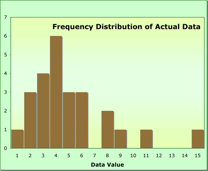
How do we judge whether or not there is predictability in the differences between real and expected values? We might do a simple non-parametric test to help us (the runs test, which we cover later). We might simply make a table of real, expected, and differences and look. However, the table might be confusing, so the book recommends that we plot real versus expected values and trust your eyes. Below is a histogram of a data set of 25 values. The distribution of the data does not seem normal. Let's see what the normal probability plot looks like.
Below is a table that lists the first five data points and the last five (note the dashes separating the two groups and remember that there are 25 data points in all). The top row is the data, the second row is the index number of each data point (they have been ordered from smallest to largest). The third row is the cumulative proportion (index/total) and the fourth row is the adjusted cumulative proportion (as per the equation above). The fifth row is the z-value for the adjusted proportion (looked up in the normality table) and the last row is the expected data value for that z-value. You should calculate rows three through six for a few data points to ensure that you understand what has been done.
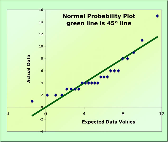
Now we plot the data versus the expected data and we get the normality probability plot below. The green line is the 45° line. It is there so that you know where the data deviates from it. Note that there is a systematic (predictable) pattern of deviation. The largest data values are too large, as are the smallest. These deviations indicate a lack of normality.
- A deviation from a straight line on the plot (with expected values on the x-axis and real data on the y-axis) indicates that the data is not normal (see below). To figure out what has happened, you have to ask where the expected and real values differ and which is larger or smaller than it should be. If the points in some region of the plot are all below the 45% line, then the expected values are too small. If above the line, then the real data is too big. Both are evidence that the distribution of the data is skewed.
An alternative test is based on the cumulative probabilities of the actual data versus that of a normal curve with the same mean and standard deviation. You calculate both for each data point or data class if you are reading from a frequency table and subtract the actual cumulative probability from the expected cumulative probability. One can then judge normality based on the largest absolute value of the differences tested with table published by Stevens (Stephens, M. A. 1974. EDF statistics for goodness of fit and some comparisons. Journal of the American Statistical Association, 69:730-737)
Becoming Normal
if the data are obviously not normal and you wish them to be, then a non-linear data transformation can sometimes correct the original data points. Often, distributions are skewed to the right (to many large values). If so, several transformations may improve normality. These include taking the log of the data, taking the square root of the data, or taking the inverse of the data.
For discrete variables (where the frequency distribution will be a histogram, not a smooth curve), there will be a discrepancy between probabilities gotten from summing up the areas represented by the bars and getting the area under a smooth curve
one should subtract a half unit from lower limit and add a half unit to upper limit before calculating the z values
units here refers to the units of the original data, the x values, and not the z values
need to do this as the discrete values represent columns on a histogram, with the unit value at the center of the column
Last updated September 9, 2011