|

Sunrise at Canis Bay Lake, Algonquin N.P., Ont, Canada |
BIO 412
Principles of Ecology
Phil Ganter
302 Harned
Hall
963-5782
|
Lab 3 Spreadsheet Graphics
Email me
Back to:
Introduction:
This lab is
designed to be a brief introduction to the use of spreadsheet
graphics. We will use the spreadsheet program available in the
biology computer lab, MS Excel. However, as before, there are
more similarities among spreadsheet programs' graphics than
differences, so, once you learn to use this one, you should be
able to figure out how to use other programs. Just keep in
mind that there is a way to do what you want to do and don't give
up until you find it.
This lab should be
read when you are sitting in front of a computer with a
spreadsheet program running. It was written for the MSExcel
program, version 98, and was intended for a Macintosh computer.
However, most of it will apply to earlier versions of the Excel
program and to MS Excel running within a Windows operating
system. Remember, if you are using Windows, it may be more
convenient to resize the resolution of the monitor so that you
see more of the spreadsheet at one time. If you can't remember
how to do it, go back to the first lab.
Graphics are the
most intuitive way of presenting or summarizing data. However,
some rules apply. The first applies to labeling.
All graphs should
have a title that explains what the graphic is intended to show.
All graphs and
charts have axes and most axes are measured in some unit value.
All axes should be labeled and the units clearly labeled.
In presenting your data from the
labs, it is sometimes specifically requested that a graphic be used and sometimes
even the kind of graphic is specified. Sometimes, the means of presenting the
data is not specified and you will choose between a table and a graphic. No
matter how specific the instructions, you must be familiar with the kinds of
graphics, why a particular graphic is the correct choice for the particular
data, and you must be able to interpret and draw conclusions from the graphic.
In addition, there are always formatting decisions you will make. It is hoped
that the following definitions, descnriptions, and exercises will help.
Some Useful Terms:
- Frequency
-- the number of times a value occurs in a dataset.
- A Frequency
Table has two columns
- one for each unique
value that a dataset contains (ignoring
repeated values)
- one for the number
of times each unique value occurs
- Frequency
tables are the first step in constructing a
histogram
- Frequency
tables are useful for some statistical
calculations
- Example
of a frequency table (Frequency of different size
fruit sampled from an orchard. The sizes refer to
inches in circumference). You can see that there
were 44 fruits found that were 4 inches in
circumference.
Size
|
Frequency
|
1
|
22
|
2
|
34
|
3
|
56
|
4
|
44
|
5
|
16
|
- Numeric
and Categorical data are different
kinds of data, and different graphical methods are used to display different
kinds of data.
- Categorical
data is data that indicated an object belongs in
a particular category, such as the sex of an
individual, its genotype, or its collection
locale
- Numeric
data involve numbers (what do you know - an
obvious term!) and are either:
- meristic
(data that is counted -- i. e. number of individuals, Drosophila
bristle number, etc.). Also called discrete
data.
- metric
(measured values -- i. e. length, weight, etc.). Also called continuous
data.
- Grouping
-- grouping data is done to scale data or to change it from nominal to categorical
data. This can be necessary for many reasons. The following list is not exhaustive
but does cover the two most common reasons for grouping.
- If you
have a lot of values with a frequency of 1 or 2,
then grouping can gather similar values into
groups with larger frequencies, which may make a
much more useful graphic
- when
you want to make a histogram, but the data is
metric (continuous), it may be that no two values
are the same. Consider the situation where you
carefully weigh 100 insects. If the scale is
accurate, it is likely no two animals will have
exactly the same weight. In this case grouping
can form classes of weights, each data point can
be placed into a category, and the frequency of
weights in each category can be counted.
Excel Data Files:
- Workbook
- a workbook is an excel data file. It is what opens when you open excel.
- Worksheet
- look at the bottom of a workbook. There are several tabs there. Click on
one and you go to another worksheet within the workbook. Think of them as
pages in a book.
- You
can change the name of the worksheet (written on
the tab) by double clicking on the name presently
on the tab. This will select it and change the
cursor to the text editing cursor (a vertical
blinking line). You can now change the name to
whatever you wish.
- You
can also change the order of the worksheets.
Click on a tab, hold the mouse button down, and
drag the tab to another position in the line of
tabs. Release the button and the move is
completed.
- Worksheets
are linked together, so that you can calculate a
value in one worksheet from data on another
worksheet. Try it by adding two values from one
worksheet on a second worksheet.
- Enter a 2 and
a 3 in
one worksheet.
- Click on the tab for
a second worksheet. Select a cell and
type =
- Click on the tab for
the original worksheet and click on the
cell with 2.
- Go back to the
original worksheet (some versions of
Excel do this automatically) and type + in
the cell with the summation. Do not click
on the cell before typing, as the cursor
is already in the correct cell. Just type
+.
- go back to the
original data sheet and click on the cell
with 3.
- Finally, go to the
worksheet with the summation and look at
the formula. Notice that the cell
references are preceded by a reference to
the worksheet with the cell. Hit return
(Mac) or enter (Windows) and the answer
should appear in the cell.
Kinds of Graphics covered
here:
Excel seemingly has
an endless way of graphing things. Pies, Stars, Polar charts,
3-D, whatever. Most of them have limited utility and we will
neither cover them here nor use them in the course. We will
concentrate on the four types below.
- Histogram
- Bar Chart
(horizontal or vertical bars)
- Line Graph
- Scatter Plot
Histograms and
frequency tables:
Histograms are
graphs which have a frequency of occurrence as the Y-axis and a
categorical variable as the X-axis. The categorical variable can
be converted from a numerical variable if it is discrete but
continuous variables must be grouped before they are suitable for
constructing histograms (discrete variables may need to be
grouped also if there are two many of them or if the frequencies
are too small)
Histograms are used
to display how often a particular response occurs. Examples:
In many specie of
birds, both the male and female feed the chicks. Is the effort
comparable for both sexes? One way to demonstrate the effort
would be to construct a histogram with sex as the X-axis and
frequency of feeding visits to the chicks as the Y-axis.
We often hear that
the heights of humans approximates a bell curve (or more
accurately for scientists, a normal curve). To demonstrate this,
one might measure 100 randomly chosen people of one sex. Then one
should take the range of heights (which is a continuous variable)
and make groups. Then count the frequency of heights in each
group and make a graph. It should look like a bell curve if what
everyone hears is true.
MSExcel will make
histograms from raw data (data not in frequency format), but the
program must have some extra tools added to it. Since there is no
guarantee the these add-ons will be present all over campus, we
will take a more labor intensive approach to making a histogram.
It involves two separate steps: making the frequency table (this
is the hard part) and then graphing the frequency table.
Frequency tables:
- Please follow
the directions below exactly and in exactly the same
order. This is the most difficult command I know of in
Excel but it can save lots of time if used correctly.
- There is a
frequency function, but do not use the insert menu to
enter the command. You will do it by hand. First enter
the following values in a column: 3, 3, 4, 4, 4, 5,
5, 5, 5, 5, 6, 6, 6, 7, 7, 7. Start the data in
cell A1 so that you finish in A16. If you do not use
these cells, you will have to adjust what you type in
when you are entering the frequency function. However,
the function will actually take data that is in a row, or
in a square or rectangular matrix, or in blocks that are
not contiguous. A frequency table allows you to make the
data more compact when there is a lot of it (as in the
problems below).
- take a look at
the data - in this case it is easy to see that there are
5 categories (3, 4, 5, 6, and 7) and that each occurs
with a frequency between 2 and 5. However, this is not
always so easy to see. If the data is too numerous or
involves continuous data, the best first step is to sort
the data so that you can at least see the largest and
smallest values.
- before typing
in the formula, you have to decide on what the categories
will be. Here it is obvious, they should be 3, 4, 5 , 6,
and 7. Enter these values in a column adjacent to and to
the right of the data column and label it Categories in
the top cell. In the cell to the right of the cell with
"Categories" enter the word
"Frequencies." This will act as the label for
the column with the frequencies, which you will create
next.
- now you are
ready to type in the function.
- First
select a column of empty cells that contains the
total number of categories plus one more cell (in
this case select 5 + 1 = 6 cells). You might want
to do this in the column to the right of the
column with the categories, under the
"Frequencies" label
- Second,
while you are still "choosing" the
cells to contain the frequencies, pull down the
insert menu and click on "functions."
- You
will get a dialog box with the categories of
functions on the left and the functions on the
right. Click on the statistics category on the
left and then move the slider until you see the
"Frequency" function and choose it. You
will get a dialog box.
- There
are two separate sets of data you need to enter
into this dialog box before you can click the
enter button. Click on the upper box (look for a
blinking cursor in the box after the click).
Choose the data to be counted for frequencies
(move the dialog box out of the way if you need
to and don't worry if the data is in more than
one column). Now click on the lower box (look for
a blinking cursor in the box after the click).
Choose the categories you entered previously
(move the dialog box out of the way if you need
to). DO NOT HIT RETURN. If you
do, you will have to start again. This function
must be entered as an array function. To do this,
hold down the apple key (shift
and control keys on a Windows
machine) and then hit the return button while
holding them down.
- you should see
the frequency data in the selected columns (2, 3, 5, 3,
3, 0). The zero is the number in the "more than the
last category" category. Since there are no values
larger than 7, it is 0 here. To see what this means,
select the last 7 in the data, type 8 and hit return. You
should see the last frequency change to 1 and the one
above it change to 2 from 3.
- What about
continuous data? Here the categories should be chosen
depending on the largest and smallest values and the
number of bars you want in the graph. You have to enter
the upper value for each category and the program will
place the data into categories by looking at successive
entries in the category column.
- Enter
the values 3.23, 3.62, 4.32, 5.24,
5.33, 5.99, 6.01, 6.55 in cells D1
to D8
- As the
data is already sorted, we can see that the range
is from about 3 to almost 7. A reasonable choice
for categories in this case might be 4, 5, 6, and
7. I did not include 3 because there are no
values lower than 3 (which would be the upper
limit for the category). Enter the category
values in a column next to the data (E1 to E4)
- Select
a column of 5 empty cells (F1 to F5) for the
frequencies.
- Follow
the procedure above to insert the frequency
function.
- you should get
the frequency table as the result (it should be 2, 1, 3,
2, and a 0 for the more than category)
Making the Bar
Chart - this is described below
Bar charts:
Bar charts are
graphs with categories along one axis and numerical values on the
other axis. The bars indicate the value of each category. They
can be horizontal or vertical, which is why I did not specify
which axis gets the categorical data. You choose this by choosing
the chart type when you make a chart. The categories can be types
of things (species, colors of individuals, categories of tree
height) and the values can be anything at all as long as they are
numerical.
Bar charts are used
to present visual comparisons between a small set of values
(usually 10 or less, rarely as many as 30 values). Examples are
the mean heights of humans by sex (2 values compared), average
GPA of all TSU students by year (four values if all students are
grouped into freshman, sophomore, junior, and senior categories).
To make a bar
chart, you need to have the numerical data in an array (a series
of cells in a row or in a column). If you want to label the
categories, then you must also have them in an array. If you are
willing to take the default labels (usually you are not), then
you only need the array of values.
- Go to cell I1
and enter the following values: 3.23, 3.62, 4.32,
5.24, 5.33 in a column from I1 to I5 (you can
also copy them from cells D1 to D5). These are the mean
weights in grams of individuals of 5 species of frog
collected from the study site.
- In cells H1 to
H5 enter: Species A, Species B , Species C
, Species D , Species E. These will be the category labels.
Before you start to
make the chart, it is best to decide where it will be. Two
options are available. It can be an entire, separate worksheet in
the current workbook (the excel data file) or it can be a graphic
in a worksheet already in the workbook. The choice is yours, but
if it is a separate worksheet, then you must label the worksheet
clearly so that I know which worksheet goes with which problem.
In most cases, it is better to include the graphic as part of the
worksheet with the data and any writing you may need to explain
you answers.
- Choose a place
to anchor the graphic in the worksheet with the graphic.
This is only a temporary choice, as you can re-size and
move the graphic around in the workbook after you have
created it. Cell H 7 will do fine here so click on that
cell.
- The graphing
function is available as a icon on the toolbar at the top
of the application window. It looks a bit like a bar
chart. Click on it.
- The first page
asks you to choose the type of graphic. Choose either the
bar or column chart (your choice, they only differ in the
direction of the bars). Once you have made your choice,
click next.
- The second
page asks which data to graph. Tell it by clicking on the
line labeled and then clicking on cell H1 (don't let the
mouse button up!) and dragging the cursor to cell I5 (now
let up). The cell reference to the area should be in the
line. Usually, the correct choice for the series is
automatically chosen for you, so you can ignore the
series buttons for now. Notice that there are two
sub-pages available here and that you go between them
using the tab a the top. Once you have made your
selection, click next.
- The third page
of the dialog is where you make many of the choices about
the format of the graph. There are several tabs and I
will cover each below. Usually you must use the first
three tabs, the fourth is commonly used, and the last two
are rarely used.
- Title
-- sets title of overall graph and for each axis. Be sure you add titles,
as they are as necessary as the data if you wish to communicate with others.
Type in a descriptive overall title. Label each of the axes with what
they are and with the units if the data is numeric. Notice that the labels
are added to the graph as soon as you are through typing them. If you
want to change something, just correct the line and the graph will be
updated automatically.
- Axes
-- allows you to choose to display the axes labels or not. Usually you
want both boxes checked. Try clicking on one to see what change it makes.
You can always click on it a second time to undo the action.
- Gridlines
-- this allows you to format the gridlines.
Usually, I prefer that they be off. They clutter
the graph and do not really provide much
information. Turn all gridlines off.
- Legend
-- this is useful only when you have more than one kind of data, as the
program will give each a different bar color. In this case, there is only
one kind of data, species weights, so it is not necessary. Click it off.
- Data
Labels -- this is an option rarely used. It will place labels
near specific data points. This can be useful if you want to identify
data points in other types of graphs (scatter plots) but is not usually
useful here. You can play with it if you want.
- Data
Table -- this is also another rare option. Click on the box
with "show table" next to it. It puts the data table in the
graph. This might be useful if the graph were a separate worksheet, but
it is not here and the data is close to the graph already. Unclick the
box.
- The last page
allows you to choose where the graph will be. The top
choice is a new worksheet. If you choose it, you should
fill in a title for the worksheet. It will be used to
label the tab that get you to the worksheet. Make your
choice and click finish.
Now the graph
appears in the spreadsheet (assuming you followed my advice and
put it there). You can move and resize the chart. These rules
apply to any chart or graph.
- Move the
cursor anywhere just to the inner edge of the chart.
Click the mouse button and hold it down. You can now move
it as long as you keep the mouse button down. Try it.
- To resize the
entire graph, you must have the object handles visible.
These are little black boxes at the midpoints of the
lines around the graph and on the corners. If there are
no little boxes, you must click anywhere just to the
inside of edge the graph to get them there. To resize,
click on a little box, hold down the button, and drag the
box. Boxes on the midpoints resize the graph in one
dimension, boxes at the corners change both dimensions.
Try it.
- To resize just
the graph within the larger area, click in the graph. You
will get a fuzzy-lined box with little boxes. You can
drag the entire graph around within the total graph area
by click-and-dragging it. You can resize the graph by
click-and-dragging one of the little boxes on the edge of
the larger box.
You can also modify
almost any characteristic of the chart. Some of these
modifications are necessary, as the default choices are not very
useful. You might not like the size of the font in the labels.
The color of the bars may not meet with your approval. There is a
box around the graph, which is unnecessary. One change that is
required is to alter the background color of the chart. Why gray
is the default is a mystery. To make changes to the graph, double
click on the part of the graph you want to change. A dialog box
will come up and you must navigate through it to effect the
change you want. In addition, you can move things like a legend
and the title around just be
Rather than
describe how to do the changes, the occasion to make some changes
will be used to illustrate a greater point, one that was
mentioned in the first lab. The best way to learn about the
capabilities of a program is to work with it. If you have to
search for the way to do something, you will remember what you
found much better than if you are simply told what to do. Below,
in each of the problems, some format features for each graph are
described. It will be your task to use the information in the
paragraph above to discover the means to effect these changes. In
doing so, you will gain a more intuitive appreciation for the
larger principle of using canned programs. To use a program,
don't be afraid to play with it. Try options. Explore. This
flexibility is important. It is why this tutorial can be written
for Excel running on a Macintosh and be useful to someone using a
Windows machine. Things may not be exactly the same, but they are
close enough that some play will allow you to complete each task.
All errors can be corrected.
Line Graphs:
Line graphs in
Excel are not what you might expect from the name. Many would
define a line graph as a graph you get by plotting pairs of data
points as X and Y coordinates and then connecting the dots with a
line. Excel considers this sort of graphic to be a scatter plot
(see below). A line graph is, in essence, a bar chart in which
the bars have been replaced by dots and a line is used to connect
the dot for each category. Thus, one axis of the chart is
categorical in an Excel line graph. If both axes are numeric,
then you need to choose a scatter plot to graph them in Excel.
Line graphs are
used to show trends in categories of data. They are better than
bar charts when you wish to imply that a data point somewhere in
between two categories would have a numerical value somewhere in
between the numerical values of the two categories. Sometimes
this makes sense and sometimes not.
- For categories
in which the idea of an intermediate value makes no
sense, then a line graph would be misleading. A bar chart
has no information about intermediates and so it the
appropriate choice. An example would be the bar chart of
mean species weights you just created. Assuming that
there are no hybrid frogs (intermediates between the
categories), then it is misleading to imply what their
weights would be.
- If the idea of
intermediates makes some sense, then a line chart is
appropriate (although a bar chart may still be the
appropriate choice, especially if you do not wish to
imply anything about the intermediates). An example of an
situation calling for a line graph might be a chart in
which the mean weight of different age classes is being
graphed. The categorical data are the age classes
(perhaps 5 year classes for humans). In this case, the
categories are really arbitrary divisions of a continuous
variable: age. A bar chart would give the mean for all
individuals in a five year period, but growth would look
like a staircase in which individuals stay the same
weight for five years and then suddenly shoot up to the
next mean weight. A more realistic graph is a line graph,
where successive means are connected by a line, implying
that the mean weight will change in a more gradual
fashion through time.
The creation of a
line graph is identical to that of a bar chart, except that you
choose the line graph option in the first page of the graphics
dialog box.
Scatter Plots:
Scatter plots are
what most think of when they read the word graph. They are the
means of visualizing data pairs. Each data pair is considered to
be a set of Cartesian coordinates, usually written as (x.y),
which is where the names X and Y axes come from. You can plot
more than one Y variable but only a single X variable.
Scatter plots are
used to show relationships between two variables. How does the
size of a bird relate to the sound power it can generate? How
does the size of a countries' human population relate to the
number of endangered bird species in the country (this scatter
plot is figure 3.16, page 98 in your textbook). Relationships
(often called trends in the data) can be negative (large X
implies small Y), positive or no relationship at all.
- Notice that a
relationship between two variables does not always mean a
cause and effect relationship. The relationship in Figure
3.16, which looks as though more people lead to more
endangered species, may not indicate a cause and effect
relationship. Perhaps (not likely) it is the other way
around and more endangered species causes more people to
be in the country (just switch the X and Y axes). Perhaps
(more likely) there is a third factor causing the
relationship. Here it might be land area. More land, more
people (in general). More land, more species of birds.
More species of birds, more threatened species of birds.
Thus, when people and threatened bird species are
graphed, you get a positive relationship.
To make a scatter
plot, you must enter the data. Here we will use the data below.
There are three variables. We will first plot the relationship
between yearly rainfall (in inches) and total crop weight (tons
per hectare). Then we will plot both total crop weight and
damaged crop weight (also in tons per hectare).
| Yearly Rainfall |
Total Crop |
Damaged Crop |
| 22.3 |
107 |
23 |
| 24.3 |
124 |
25 |
| 21.5 |
115 |
27 |
| 26.9 |
136 |
43 |
| 32.1 |
149 |
99 |
| 30.4 |
151 |
89 |
| 27.2 |
134 |
56 |
| 27.5 |
133 |
47 |
| 29 |
145 |
80 |
| 24.9 |
126 |
29 |
- Enter the data
in an excel workbook. To prevent a lot of unnecessary
trouble, make sure that the variable that will be the
X-axis is on the left side of the data array, as above.
The program will automatically assume that the leftmost
column contains the values for the X-axis. You can change
this later, but it is hard to do.
- Choose a place
to anchor the graphic in the worksheet with the graphic.
- Click on the
graphics tool.
- Choose the XY
scatter plot. Once you have made your choice, click next.
- The second
page asks which data to graph. Select the first two
columns of data, including the labels on top. Once you
have made your selection, click next.
- Use the third
page to make the following choices.
- Title
-- Give the chart and the axes labels (include units).
- Axes
--Turn all gridlines off.
- Legend
-- Click it off.
- Data
Labels -- no change
- Data Table
-- Not an option.
- Choose to
enter the graph as an object in the worksheet. Click
finish.
- Once you have
the graph in front of you , you may notice some things
need changing.
- Change
the scale of the X-axis so that it goes from 20
to 35 by 5.
- Remove
the box around the graph and remove the
background.
- Move
and resize the graph within the box to get the
most informative configuration.
- Change
the shape of the points to circles and make them
larger.
Now we will do a
second graph with both y variables
- Move the first
graph out of the way. Choose a place to anchor the
graphic in the worksheet with the graphic.
- Click on the
graphics tool.
- Choose the XY
scatter plot. Once you have made your choice, click next.
- The second
page asks which data to graph. Select all three columns
of data, including the labels on top. Once you have made
your selection, click next.
- Use the third
page to make the following choices.
- Title
-- Give the chart and the axes labels (include units).
- Axes
--Turn all gridlines off.
- Legend
-- Leave it on. For once it is useful.
- Data
Labels -- no change
- Data
Table -- Not an option.
- Choose to
enter the graph as an object in the worksheet. Click
finish.
- Once you have
the graph in front of you , you may notice some things
need changing.
- Change
the scale of the X-axis so that it goes from 20
to 35 by 5.
- Remove
the box around the graph and remove the
background.
- Move
the legend and resize the graph within the box to
get the most informative configuration.
- Change
the shape of the points to circles (total crop)
and make both symbols larger.
- remove
the box from around the legend.
Putting lines
in scatter plots:
When you make a
scatter plot, it is usual that the points are not connected by a
line (this is done only in particular circumstances). They are,
as the name suggests, a scattering of points. However, there may
be a trend in the points, such that high values of X are
associated with high values of Y. In the graphs above, there
appeared to be a tendency for both Y variables to go up as
rainfall went up (a positive relationship). How can we
characterize this trend?
The usual way is to
enter a trend line. Really, it should be a trend curve (a line is
a special type of curve). In the crop graph, the trend looks like
a straight line for the Total Crop data, but not so straight for
the Damaged Crop trend. There are ways to estimate the best trend
line for a relationship, but we can not go into them now.
However, we can get the program to do this for us.
- Click on one
of the Total Crop data points. This should select all of
the Total Crop data points.
- Perhaps without your awareness,
you got a different set of menu choices in the menu bar at the top when you
chose to edit the graph. One of the new choices is Chart.
Pull it down and choose "Add Trend line".
- This brings up
a dialog box with two tabs. One allows for a choice of
trend line types. Almost all of the time, the simplest is
the best and the simplest is the linear trend line
(described by y = mx + b). Choose it for the total crop
line.
- The second tab
allows you to name the trend line (do so if you want). If
no name is entered, a default name is given and will
appear in the legend. You can add the equation for the
line (a good choice) and you can add something called r 2.
R-square is a measure of how well the line and the data
agree. More formally, it is the proportion of variation
in the Y-axis data that is accounted for by the line.
Now we can choose
the line for the Damaged Crop data.
- Click on one
of the Damaged Crop data points. This should select all
of the Damaged Crop data points.
- Pull Chart
down and choose "Add Trend line".
- Choose a trend
line type for the Damaged Crop line. (Hint - only one
goes both up and down, but you will have to modify the
default options.)
- Name the trend
line, add the equation for the line and r2
(you have click on the other tab to do this).
Error Bars:
| Yearly Rainfall |
Total Crop |
Damaged Crop |
Damaged Error |
| 22.3 |
107 |
23 |
3.4 |
| 24.3 |
124 |
25 |
4.2 |
| 21.5 |
115 |
27 |
5.6 |
| 26.9 |
136 |
43 |
6.9 |
| 32.1 |
149 |
99 |
8.0 |
| 30.4 |
151 |
89 |
8.8 |
| 27.2 |
134 |
56 |
2.3 |
| 27.5 |
133 |
47 |
5.9 |
| 29 |
145 |
80 |
6.0 |
| 24.9 |
126 |
29 |
3.3 |
Often, we calculate
not only a mean value for a category of data but also some
measure of variation in the data for that category. In some
cases, it is possible to display this information as part of the
graph as error bars around the averages.
For line graphs and
bar graphs, you need to enter the size of the error in a separate
column so that the first entry in the error bar array is the
error for the first value of the original data array. Go to the
first bar chart data and enter these values: 0.62, 0.44, 0.51,
0.92,
and 0.31. These numbers represent
some measure of the variation within each species.
Double click on the
bar (any bar) in the first chart you made. This will select all
of the data in that category and open a dialog box on format.
Choose the tab for Y error bars for vertical bars and X error
bars for horizontal bars (it depends on which you want, usually
it is y). In the display, choose the option for half error bars
above (this is one of three options on how the error bars will
appear - here the lower portion of the error bar would not add
any more information and would make the graph
"busier").
In the error amount
section, there are several choices. Most are useless and you will
often choose "Custom". Choose custom now and click in
the + line (this corresponds to the error displayed above the
data on the graph). Click in the box next to "Custom"
so that you get a blinking cursor. Go to the column of errors
(move the dialog box if you must) and select the errors you want.
Hit Okay.
For scatter plots,
the procedure is mostly the same except that you usually want the
error bars to extend both above and below the data point. To do
this, enter the new column of data in the scattergram data matrix
(from the table above). To to the scattergram you made from this
data, click on any of the data points and get the same dialog
box. Make the appropriate choice in the display area of the Y
error bar tab and enter the same column of errors twice in the
error amount section: once in the + line and once in the - line.
Hit Okay. If you want to explore, choose the x error bar and do
the same thing (use the same error data).
Rules for
Scaling:
A few remarks on
how to scale axes. We will not cover scaling in which the values
are transformed (such as taking the square root of the values
before plotting the graph).
- The axes
should just hold the data from largest to smallest
- There is no
need to have the 0,0 X- and Y-axis intersection in the
graph. As long as the axes are clearly labeled, it is not
misleading to remove lots of blank space from the graph
by re-scaling the axis.
- If the range
of values for one variable is very large, or if data
points are mostly clustered in one part of the range, a
more clear depiction of the trends may be had by
transforming the data. A Transformation is a mathematical
re-sizing of the data done before plotting the data and
the same transformation procedure is applied to every
data point for that variable. There are many
transformations and we will not go them here except to
point out a few as examples.
- Data
with a large range may be log transformed (take
the log10 of each datum) so that a range from 10
to 100 becomes a range from 1 to 3.
- Data
with many small values and a few large values may
be square root transformed. Here the few large
values are greatly reduced and the small values
are not changed by much. Consider the values 2,
3, and 144. After transformation, the values are
1.41, 1.73, and 12. The ratio of smallest to
largest falls from 72 (=144/2) to 8.5 (=12/1.41)
- If two Y
variables are to be plotted, but one has much larger
values, then it is permissible to transform one so that
they have comparable ranges. Indicate the transformed
data by changing the column label for that data so that
the legend says that it is transformed data.
Problems:
Reminder:
axes must be labeled and the labels must include the units (where
appropriate)
1. Make a frequency
table from the following data. This data is integer data, like
you get when you are counting numbers of individuals (you cant
get a fractional individual). Use the methodology described above
to make the table (doing it by hand will not get you any credit).
Label the two columns of the frequency table "Category
Values" and "Frequencies". Remember that you can
enter the data as a vector (row or column) or as a matrix (square
or rectangular -as you see below). The values range from 1 to 17.
| Data matrix
|
|
|
|
|
| 1 |
2 |
8 |
9 |
12 |
| 1 |
2 |
8 |
9 |
12 |
| 1 |
3 |
8 |
9 |
12 |
| 1 |
3 |
8 |
9 |
12 |
| 1 |
3 |
8 |
9 |
12 |
| 4 |
3 |
8 |
9 |
12 |
| 4 |
3 |
8 |
9 |
12 |
| 4 |
3 |
8 |
9 |
17 |
| 5 |
4 |
8 |
9 |
12 |
| 5 |
4 |
8 |
9 |
13 |
| 5 |
4 |
11 |
8 |
13 |
| 5 |
4 |
11 |
8 |
12 |
| 5 |
4 |
11 |
10 |
12 |
| 6 |
7 |
11 |
10 |
12 |
| 6 |
10 |
11 |
10 |
12 |
| 7 |
10 |
13 |
10 |
15 |
| 7 |
10 |
13 |
10 |
16 |
| 7 |
10 |
13 |
10 |
15 |
| 14 |
10 |
13 |
17 |
11 |
Check your results
by summing up all of the frequencies (use the summation
function). What total did you get? What total should you get (and
why)?
2. The data above
have some gaps and some low-frequency values. Regrouping the data
will produce a better graphic. Regroup the data by redoing the
frequency table, but use the following category values:
0, 3, 6, 9, 15, and 18
Check your results
by summing up all of the frequencies (use the summation
function).
3. Make a frequency
table from the continuous data (weights of fish) below. There is
a wide size range, from hatchlings to large adults so the data
ranges from 0.010 grams to 12.045 grams. Do two frequency tables,
one with one gram category values and another with three gram
category values.
Data Matrix
|
| 1.518 |
1.543 |
1.743 |
| 2.392 |
1.554 |
8.588 |
| 1.536 |
1.685 |
5.010 |
| 0.046 |
0.392 |
0.010 |
| 0.031 |
1.823 |
8.001 |
| 2.408 |
4.669 |
1.521 |
| 5.916 |
2.232 |
1.431 |
| 11.05 |
0.264 |
3.495 |
| 8.000 |
2.535 |
13 |
| 2.047 |
2.665 |
9.225 |
| 0.053 |
2.784 |
12.602 |
| 7.213 |
2.895 |
3.954 |
| 9.117 |
3.211 |
5.310 |
| 6.224 |
6.540 |
10.220 |
| 0.750 |
1.100 |
12.045 |
Check your results
by summing up all of the frequencies (use the summation function)
for each table.
4. Make a bar chart
from the frequency table in problem 2. Before you make the
graphic, it might be easier if you made some category labels. To
do this, you will need blank cells next to the frequencies.
- If they are
blank, then type in category labels (like 1 to 2, 3 to 4,
etc.) to the left of the appropriate frequency.
- If they are
not blank (many of you will have put the category values
there), you should first insert cells between the
frequencies and whatever is on the left side of them.
- Do
this by selecting the frequency cells and then
pulling down Insert on the menu bar.
- Choose
cells and, when the dialog box come up to
ask which way to move cells to make way for the
new cells, choose over. Notice that the program
updates all of the cell references so that no
calculations are changed.
- Now
you can type in the labels (1 to 2, 3 to 4,
etc.).
Insert always puts
the new cells on the left hand side of the chosen cells and moves
the new cells and everything to the right of them to the right
(or on top and moves the old cells down if you choose down).
- The bar chart
should have these characteristics: Title, axes labels, no
background color, appropriate scales for axes,
appropriate labels for categories.
5. Make a bar chart
of the following table, including error bars (label the axes and
title the graph). The data are taken from a group of 20
partridges reared from the egg.
Age of
Chick
(weeks)
|
Weight of Chick (grams)
|
Standard Error (grams)
|
| 1 |
27.4 |
7.3 |
| 3 |
48.8 |
7.2 |
| 5 |
62.5 |
8.7 |
| 7 |
121.3 |
9.8 |
| 9 |
149.7 |
10.4 |
| 11 |
244.2 |
12.1 |
- The bar chart
should have these characteristics: Title, axes labels, no
background color, appropriate scales for axes,
appropriate labels for categories, error bars over top of
bars (not below).
Now, present the
data as a line graph (including error bars).
- The line graph
should have these characteristics: Title, axes labels, no
background color, appropriate scales for axes,
appropriate labels for categories, error bars around data
points.
6. The table below
is data from experimental fields over a long time. It has the
rainfall measured at the field, the total crop (in tons per
hectare), the error associated with the total damage measurement
and the tonnage of the portion of the crop that was damaged by
insects to the point that it could not be sold (total tonnage =
useable tonnage + damaged tonnage). Enter the data in your
spreadsheet.
| Year |
Yearly Rainfall
(inches) |
Total Crop
(Tons/Hectare) |
Damaged Crop
(Tons/Hectare) |
Error
(Tons/Hectare) |
| 1 |
22.3 |
107 |
23 |
10 |
| 2 |
24.3 |
124 |
25 |
15 |
| 3 |
21.5 |
115 |
23 |
10 |
| 4 |
26.9 |
136 |
43 |
20 |
| 5 |
32.1 |
149 |
99 |
15 |
| 6 |
30.4 |
151 |
101 |
20 |
| 7 |
27.2 |
134 |
56 |
25 |
| 8 |
27.5 |
133 |
47 |
20 |
| 9 |
29 |
145 |
92 |
10 |
| 10 |
24.9 |
126 |
29 |
15 |
Graph the
relationship between total crop and rainfall with error bars for
total crop. Fit a linear trend line and present the equation for
the line and the r2.
- The scatter
plot should have these characteristics: Title, axes
labels, no background color, appropriate scales for axes,
Y-error bars around data points, trend line with equation
and r 2.
Graph the
relationship between rainfall and both total crop and damaged
crop. Fit trend lines and present equations for each line and the
r2's (Hint: a linear trend line is not appropriate for
the damaged crop data. Choose one with a better fit).
- The scatter
plot should have these characteristics: Title, axes
labels, no background color, appropriate scales for axes,
trend line with equation and r 2. No error
bars here.
Problems
7 and 8 represent extensions of what you have learned above.
7. Planarians will
lose weight when they are starving and, of course, will grow when
they receive enough food. You have a series of aquarium tanks to
which you will add some planaria and a constant supply of food.
You also have a model of planarian growth in these tanks. Y is
the predicted average total weight (grams) of planarians per tank
after two months in the tanks and X is the total weight of
planarians (grams) initially added to the experimental tanks.
Graph the following formula that relates these two variables:
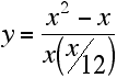
Graph them over the
range of 0 to 10 grams added to the tank (the ranges you are
considering using). Label the axes (with units) and title the
graph. Answer this question. What is the break-even point at
which the total weight of planaria at the end of two months is
equal to the total weight initially added to the tank?
Hint: - you have to
choose the X values to use. Start with 1, 2, etc. but put extra
values in if the graph line shows a lot of change between any two
points already plotted.
8. Make a chart
that compares the effect of diet for each sex. Include the error
term and label the axes and title the chart. (Hint: to receive
credit, you will have to have all of the data on the same chart
and this will involve entering the data in a different order than
is presented below.)
| Sex |
Diet |
Adult
weight (grams) |
Standard
Error (grams) |
| Male |
High Fat |
492.4
|
17.6
|
| |
High Protein |
532.3
|
21.4
|
| |
High Carbohydrate |
481.2
|
12.3
|
| Female |
High Fat |
427.2
|
13.8
|
| |
High Protein |
477.8
|
21.1
|
| |
High Carbohydrate |
239.1
|
10.1
|
Draw some
conclusions about the effect of both sex and diet (and the
interaction between these factors) based on the chart.
How to submit this assignment:
The assignment will
be submitted through the internet. It will not be accepted in any
other format as there is no way to check formulas. If you forget
how to submit, see the end of of the first lab on spreadsheets.
Last updated August 30, 2006